Da Costakade
Comprehensive Canal House Renovation and Redesign on Da Costakade
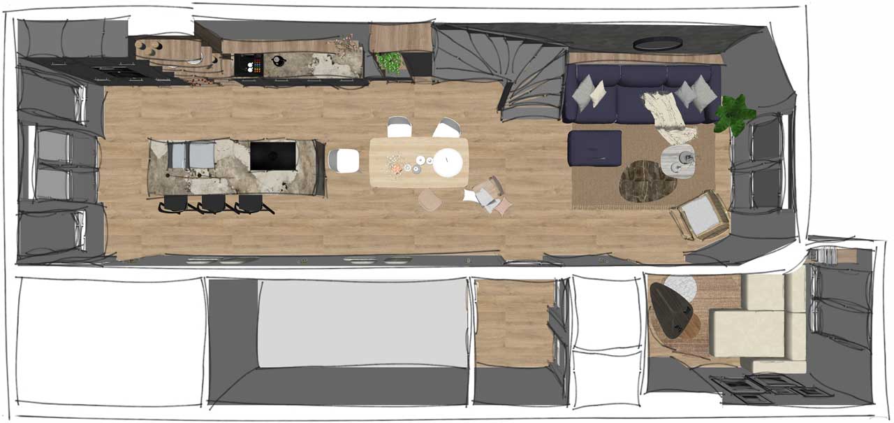
The essence of this project centered around the creation of a more expansive and inviting kitchen area, with a grand island as its centerpiece – a place where the clients could gather and connect. To realize this vision, a complete interior redistribution was essential. The existing kitchen was tucked away in the corner room at the bottom right of the floor plan, while the living room occupied the opposite end.
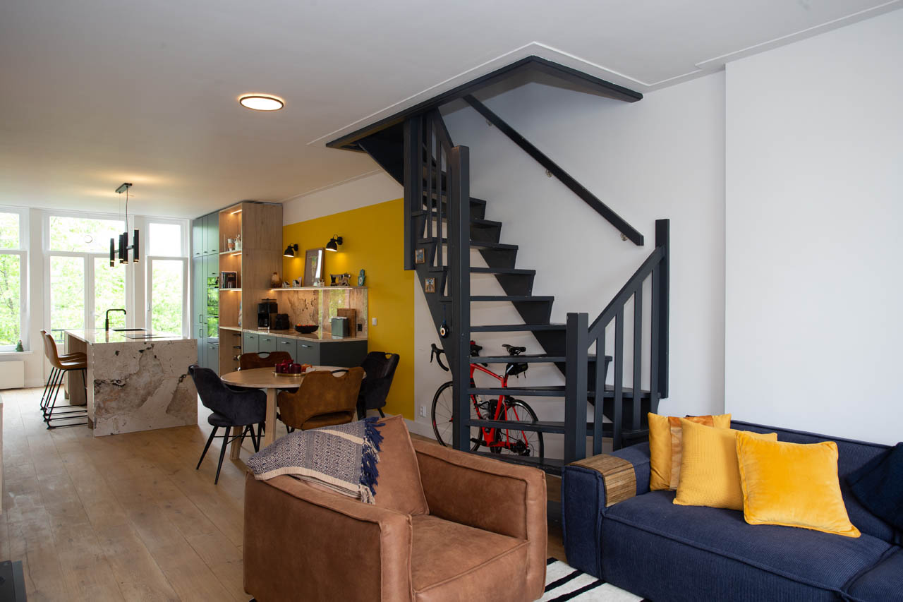
Our solution was to relocate the kitchen, effectively replacing the existing living room and TV area. This transformation allowed us to fulfill our client’s desires for a more spacious and functional kitchen while seamlessly integrating the living area, which, in turn, connected to the spare room that once served as the kitchen. Upon entering the apartment, we strategically placed all the main functions along the long wall facing the entrance, creating a harmonious flow from the kitchen to the living room and onwards to the games room. This design choice ensured that the entire beauty of the space could be captured at a single glance upon entering.
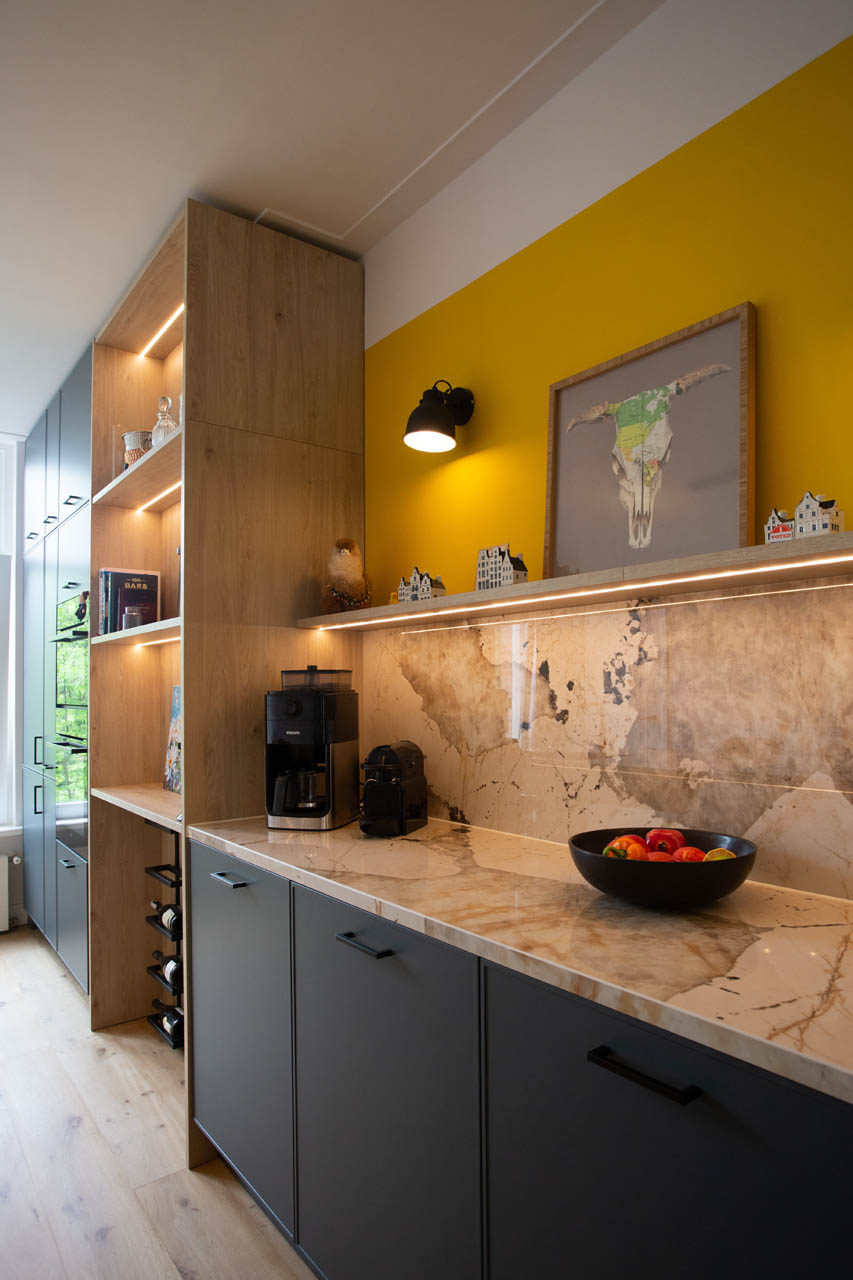
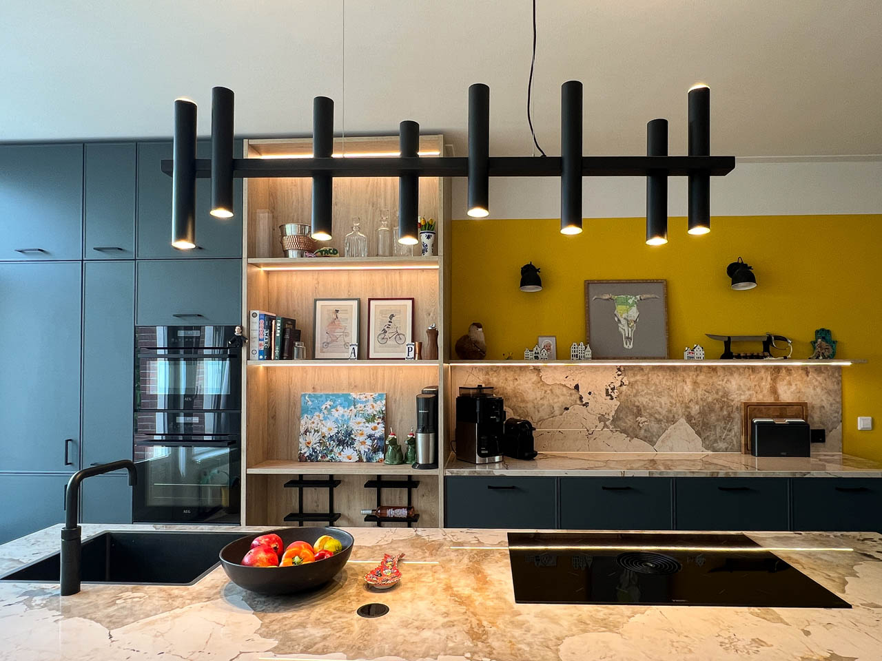
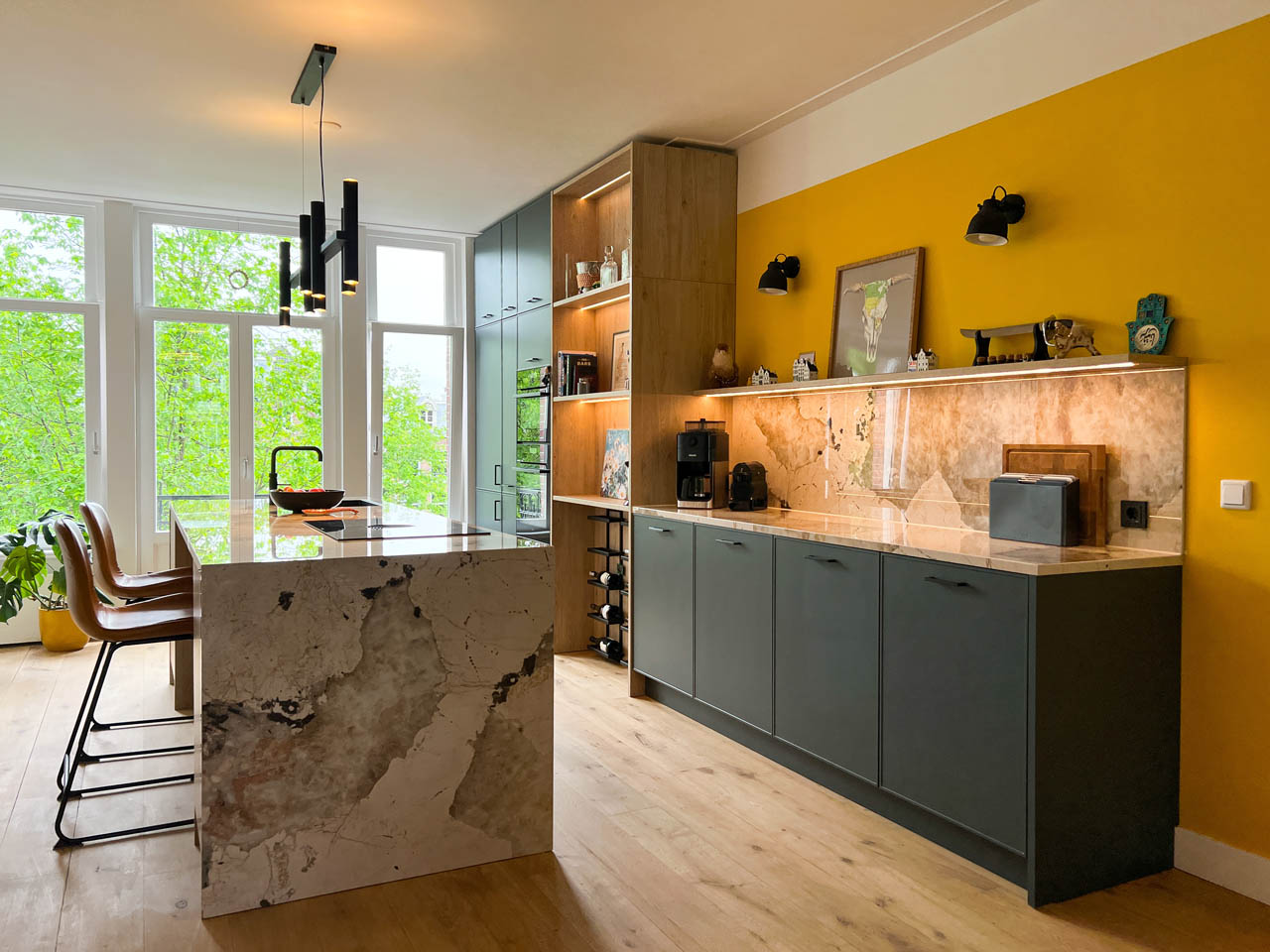
Designing the kitchen presented unique challenges due to the presence of an existing column on the wall where we planned to position tall cabinets. Instead of limiting our creativity, this constraint inspired our design approach. We utilized the column as a functional element by distributing kitchen functions on either side. On the left side, we concealed the column with open niches and shelves, simultaneously adding more storage and character to the kitchen. On the right side, we opted for lower cabinets to maintain a continuous visual flow.
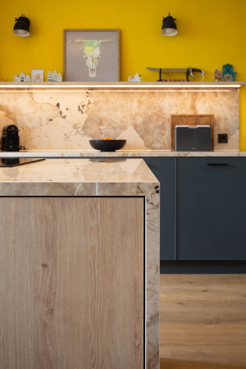
The substantial island required additional support for its expansive countertop. To address this, we placed narrow cabinets on each side of the island, framing the bar seating area. The countertop seamlessly cascaded to the floor on one side, while the other featured a full row of cabinets, providing essential functionality.
The project’s moodboard exuded vibrancy and color. Navy blue cabinet fronts harmonized and contrasted with the veined composite countertop. We extracted tones of mustard, beige, and brown from the composite’s veins, applying them to the wall paint above the lower kitchen cabinets, as well as the wood- textured niche in the kitchen that covered the column.
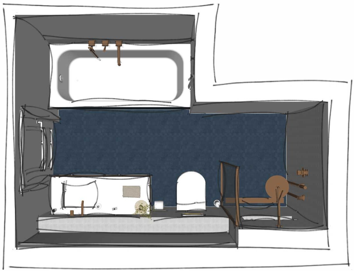
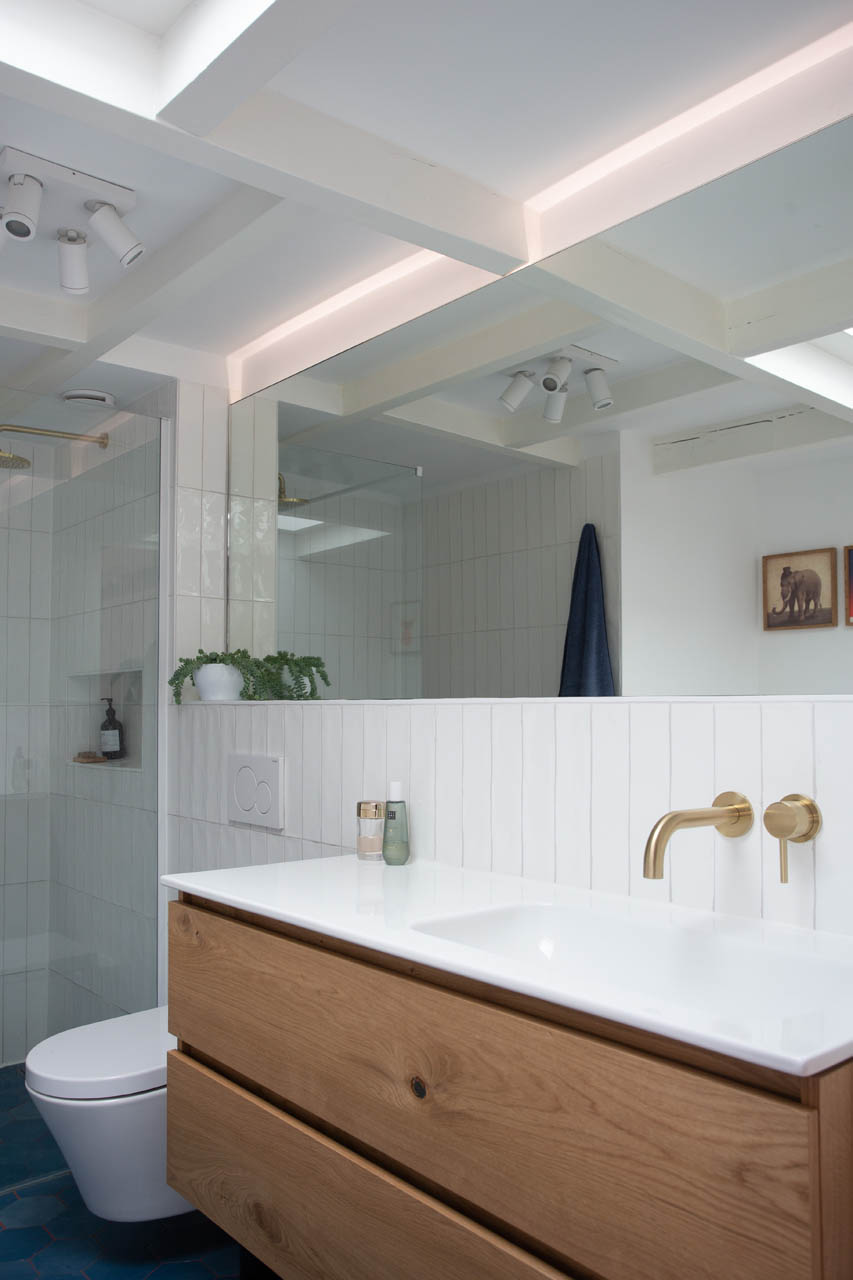
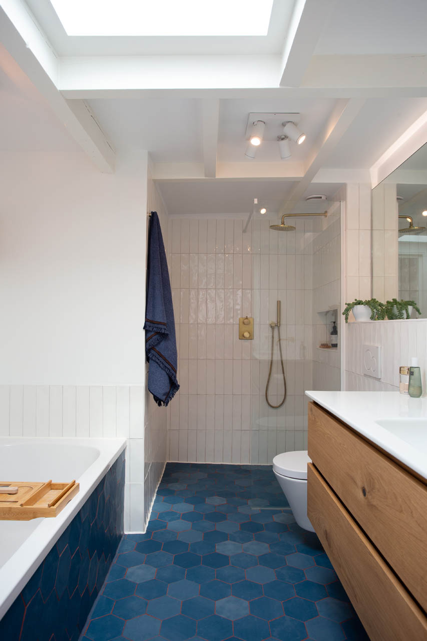
The upper floor bathroom was not excluded from our renovation efforts. Here, we transposed the same moodboard of colors and textures from the kitchen, creating a cohesive and stylish look. A standout feature in the bathroom was the client’s choice of a built-in shower tab set. To accommodate this preference, we extended the wall to the right of the bathroom door by 20 cm, allowing for the placement of a built-in shower set and a compact built-in toilet installation. In the shower area, we incorporated niches for shampoo storage, and the wall continued to a height of 120 cm from the floor in the sink and toilet area. Here, we positioned the mirror deeply into the wall, providing a continuous support surface along the sink and toilet at the 120 cm height.
If you aspire to redefine the functions within your home and embark on a comprehensive redesign, we stand ready to assist you with confidence and creativity.
DETAILS
Amsterdam | 2022
CATEGORIE: Woning renovatie
PROGRAMMA: Totaal realisatie
FOTO: Luci Photography
Stuur een e-mail naar [email protected]. We maken graag een afspraak voor een startgesprek. Kijk anders gerust nog even verder.

